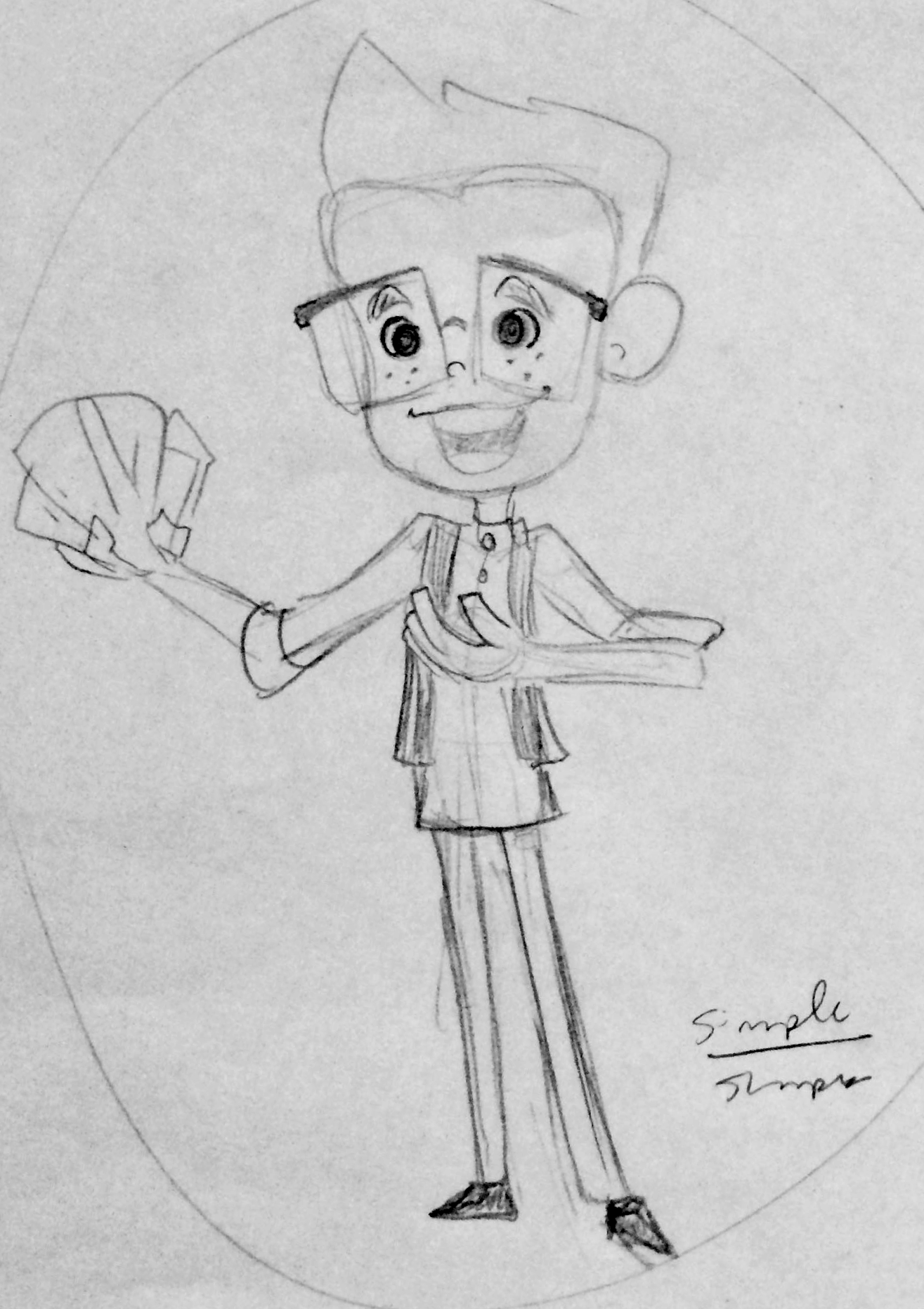
Aidan’s Magic Corner - title card pitch
This was a character design and title card pitch for an original series.
In the end we went with live-action photos and minimal gfx, but I really liked the work here as I was experimenting with shape language in character design - going for a more square approach to the head and fingers than I normally would have, both in homage to the card tricks that the talent was known for and to give him a sharp and witty appearance. I wanted the card to express mystery and whimsy, and the little bit of character animation here showcases the card tricks the viewer would expect to see in the series. I’ve included a few pencil sketches along with the final work below. I built and animated this piece in After Effects with shape layers and rotation based animation.


